It's not just haute couture models parading down the runway with the latest spring fashions.
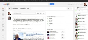
Google+ has done its first redesign since launching last summer and my initial impression is that I'm giving this a plus one for the right direction.
Interesting that none of these enhancements were previewed at PRSA's Digital Impact Conference last week when keynote speaker, Google+ developer Timothy Jordan, said to the audience he had nothing to announce.
Well, it's about 10 days later and there's news now :).
The design seems more intuitive than before. It's easier to find things at a glance. And it looks more social, more inviting for people to share. Maybe that will attract additional consumer users.
Here's a quick summary of the changes:
- Lots of Google's signature white space – maybe too much right now. According to Vic Gundotra (via Robert Scoble) this space will be used for a new feature that's still being developed. (There's a funny meme going around about what do do with the space.)
- The navigation bar is on the left and vertically displays the default Home, Profile, Explore, Hangouts, Photos and More apps. Hover over More and you see the apps inside it including circles and pages.
- You can drag and drop apps to customize the navigation order and replace the default icons with ones listed in More. But you can't display more than six at a time.
- Each post now has a border making it distinct and easier to follow; Google calls these 'conversation cards'.
- Hangouts, which used to reside near the bottom right of the page are now prominently displayed at the top of the narrow right column and in the navigation bar. And you can test out hangouts with extras such as sharing an image from your screen or a document. Coming soon: Hangouts on Air which lets you live stream and record a hangout, extending its reach.
- Also in the narrow right column is the chat feature, which I've used for IM and video and which works well.
- To the right of the newsfeed are trending topics, people you may know and people you may like (I'm not sure what criterial they used for these).
- On the profile page, you can choose two ways to display cover photos; one large image or five smaller shots.
Google+ has a lot going for it. But it still seems a bit formal when you compare it to something like Facebook or that happening online space, Pinterest.
Maybe its nomenclature that doesn't quite fit with what it's suggesting you do; I hangout with my friends, not my circles. It's a little like someone's dad who's trying too hard to be hip.
And the Google minimalism makes it feel a bit too wide open at the moment, like a neighbourhood under construction (in a sense, that's what it is). As a result it doesn't feel private even when I share a post with a limited group. Perhaps the design should have some sort of visual differentiator between private and public – on the newsfeed and your profile page.
Maybe they could take the customization they've started even further and let us really add some personality to our page. I'd like a way to personalize my profile, say change the order and highlight certain items like my blog. Enabling that could be a differentiator.
That said, I like where it's going.
I haven't been as active on Google+ lately but the changes are encouraging me to to spend more time on the site. One thing I've always liked about the platform is the ability to edit a post after you publish and in my case, correct more than a couple of typos. I also like that there's no 140 character limit and the kinds of discussion that can spark.
It's also naturally integrated, via its birth parent, to search – still the number one thing we do online.
At Digital Impact, Timothy Jordan said that Google+ now has 50 million active users (defined as those who log in once a week) and 100 million accounts. That's a lot of traffic and yet it still feels like a road less traveled.
As my colleague Sherrilynne Starkie said, there's lots of potential here. Now, the masters of search and video have to figure out how to unlock social for the mainstream consumer.
What do you think about the redesign? Will it make you spend more time on Google+?
Here's a link to my G+ profile (I'm open to suggestions).

